• Hey everyone, staff have documented a list of banned content and subject matter that we feel are not consistent with site values, and don't make sense to host discussion of on Famiboards. This list (and the relevant reasoning per item) is viewable here.
  • Do you have audio editing experience and want to help out with the Famiboards Discussion Club Podcast? If so, we're looking for help and would love to have you on the team! Just let us know in the Podcast Thread if you are interested!

Discussion Nintendo almost went back to Mario’s Pre-GameCube/N64 design (Super Mario Bros. Wonder)

isaacmaltes

Octorok
Pronouns
any
GJJRAGfXUAA4PyD.png


(Via GDC)

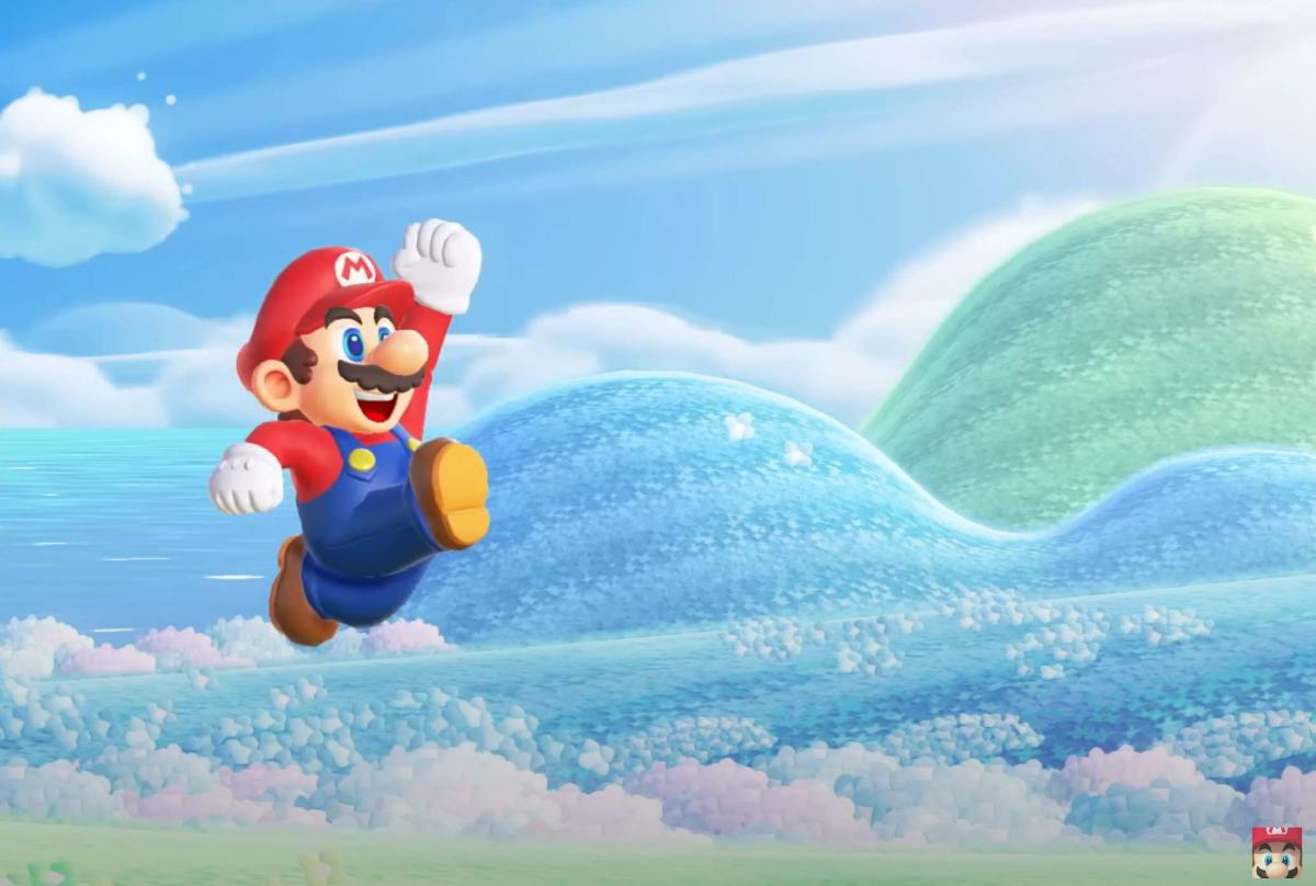
This is insane to me. I don’t think people understand that Mario’s design has stayed generally the same since the GameCube.

We were this close to going “Classic Mario”

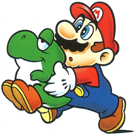
Looks like how he did back in Super Mario World!
 
That would have been ace tbf, though I do love the style they settled on in the end. I take it these presentations will end up on youtube eventually?
 
He looks great in Wonder but I would still love a Mario game that feels like I’m experiencing the characters and world as envisioned in the classic Kotabe art.
 
Would have been cool. Perhaps they wanted to avoid any inference of the classic Mario being distinct from modern Mario though.
 
0
I think wonder nailed it tbh except the renders, box art and etc. In game he looks nothing like Odyssey or 3D World Mario. Yoshi even looks like "beeg Yoshi meets World box art Yoshi" in game.

His model, and Peach's, Daisy's, Luigi's and etc resemble almost exactly Kotabe style but 3D modeled with a very good shading and animation work.

I really loved what they did and I think they can go nuts on a sequel like Galaxy -> Galaxy 2 or BotW -> TotK. Hope they can make one not so late in The Succ's life.

Also I badly wanna see Rosalina here so please make a DLC expansion!!!
 
22119301.jpg
not classic enough, they need to go back farther.
like “jumpman’s” design on the original Donkey Kong arcade flyer.

or do a licensing deal to turn the game into “Super Popeye Wonder” featuring the iconic comic strip character.
 
22119301.jpg
not classic enough, they need to go back farther.
like “jumpman’s” design on the original Donkey Kong arcade flyer.

or do a licensing deal to turn the game into “Super Popeye Wonder” featuring the iconic comic strip character.
for real though, they should go back to the red overalls/blue shirt look whenever they make a new Mario vs Donkey Kong
 
While that is cool, I think I prefer what we got. Its a mix of both worlds honestly. It has a good mix of modern, while adding some bits here and there to make it more in line with art work that we grew up with in the 90's
 
It's so hard to tell in that screenshot. Could have used more examples.

I like the one we got tbh.
 
0

As much as I love the wonder design, this is painful. Stuff like this I don’t want to know, let me live in blissful ignorance
 
I've been hearing this, but I still have trouble seeing it. Are the renders really that fundamentally different from what we're seeing in this image?

Or do we just have a different idea as to what qualifies as "looking nothing like Odyssey or 3D World Mario"?

I feel like there's weird erasure going on this thread like Wonder didn't attempt a radical throwback with its art style

72cSYZll.jpg


3D World absolutely looks more like the former,

wxyDjbql.png


I FOUND THE ART IT REMINDED ME OF


Yoshihold.jpg

and Wonder absolutely looks more like the latter...

Phrasing a piece of concept art being subtly more loosely "drawn" in style as "what we could've got" feels a bit much
 
I feel like there's weird erasure going on this thread like Wonder didn't attempt a radical throwback with its art style
Changing the animations is one thing, but apart from the animations I don't see where else the "radical throwback" is happening. If anything the 3D World screenshot that you used just makes "he looks nothing like 3D World Mario" look even more like an exaggeration when you put it next to the SMBW jumping screenshot
 
So you're telling me instead of making the best looking Mario game they almost made the best looking Mario game? Those batards!
 
Changing the animations is one thing, but apart from the animations I don't see where else the "radical throwback" is happening. If anything the 3D World screenshot that you used just makes "he looks nothing like 3D World Mario" look even more like an exaggeration when you put it next to the SMBW jumping screenshot
…the 3D World jumping animation/model is WAY closer to the NSMBU example than the Wonder example.
 
Nintendo elongates Mario in 2002
Wait, are you telling me that the difference between these "jumping" images really does just boil down to his proportions? From the way people were talking about things I thought there was something else that I missed, if there's nothing else then that goes back to my point about "he looks nothing like 3D World Mario" sounding like an exaggeration
 
Probably better to wait for GDC to post the presentation in full before trying to make a comparison image, but since people aren't seeing the difference:

Wapo1Ed.png
Maybe it is the low quality, but the eyes actually look more lively in that Version. I also like him having seemingly bigger feet and being longer, though it could be that this manly is just a Distortion Effect of the Screen Capture.
 
Wait, are you telling me that the difference between these "jumping" images really does just boil down to his proportions? From the way people were talking about things I thought there was something else that I missed, if there's nothing else then that goes back to my point about "he looks nothing like 3D World Mario" sounding like an exaggeration

...well, if you won't concede this point then please at least tell me you would agree with me that the thread's premise is a massive exaggeration as well
 
...well, if you won't concede this point
What point are you referring to? Without someone going more in depth into things I'm genuinely having trouble figuring out what it is that everyone else has spotted that I'm missing.

But yes, that concept image doesn't really scream "going back to Mario's pre-Gamecube/N64 design" to me.
 
The current render already hits that 2D animated look, I don't see this prototype design as either better or worse - just different.
 
What point are you referring to? Without someone going more in depth into things I'm genuinely having trouble figuring out what it is that everyone else has spotted that I'm missing.

But yes, that concept image doesn't really scream "going back to Mario's pre-Gamecube/N64 design" to me.

I think the sum of all the subtle adjustments creates something quite different, but it may just be something we can't agree on. But really I only brought it up because the difference between 3D World to Wonder is objectively larger than Wonder to this concept art, which we seem to agree on, just to a varying degree.
 
0
Can someone please explain what about any of these "designs" is different? I am so confused by this thread.

It's not like it's radically different but the differences between top left and top right seem pretty obvious 🤷 I can't explain the difference in the concept art, it really seems like a thread made entirely on the fact he has slightly bigger/looser eyes in concept art
 
0
Can someone please explain what about any of these "designs" is different? I am so confused by this thread.
The overall proportions, the color/shading style, the shape of the facial features, the lengths of the limbs, and it's even more pronounced in motion when you see all the detailed animations (especially in the face) for Wonder Mario. The eyes and brows are especially much more cartoony and mimic the classic Kotabe art more.

And every one of the above things looks to be even more pronounced in that concept image, the eyes especially.
 
This is the first time I've seen that get brought up as a difference, could you elaborate on what these differences are? Because even now I'm still not seeing it
There's a softer, sorta pastel gradient way of shading on the Wonder model, that aligns more closely with the old Kotabe art. The NSMB model is lit/shaded in an almost plasticy way.

If you compare just the two models on top here, especially the shirt/hat and the face:

jzX8a2Cl.png


you'll see where the shading technique is different. Wonder's style is much softer and has more pronounced edge-lighting, echoing the gradient style of shading that was common on old 80s and 90s boxarts.
Thanks for telling me what everyone else saw that I missed, but I still think people are making these subtle changes seem bigger than they actually are. It's not exactly the "throw everything in the trash and start over" approach that I've seen certain people demand from Nintendo.
 
The older design is great, full on old-school rather than the refinement of the same design that we ended up with.
Both look amazing and it's great that we got what we got. I genuinely hope they keep up with this new direction going forward!
 
0
People not noticing the difference between the designs is blowing my mind. I barely care about this kind of stuff and the differences are just ridiculously evident.
 
People not noticing the difference between the designs is blowing my mind. I barely care about this kind of stuff and the differences are just ridiculously evident.
Mario’s face looks much more cartoonish and reminiscent of early Kotabe art.
The final does a good job resembling Kotabe the best it can; but it’s still definitely “modern” Mario, the same model we’ve been used to since the GameCube era.
 
0


Back
Top Bottom