
lemonfresh
#Team2024
- Pronouns
- He/Him
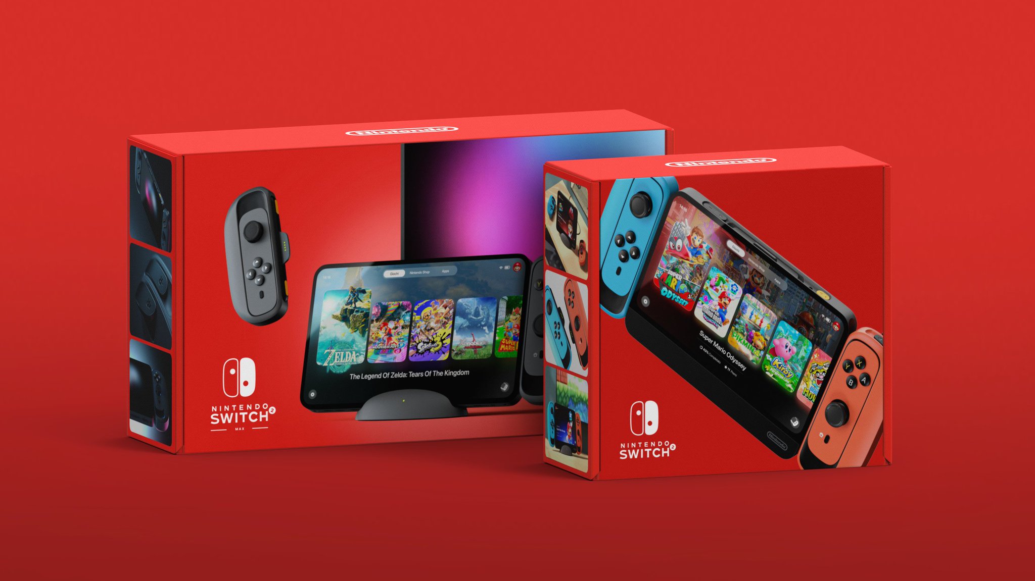
Saw this in the hardware thread its such a well done mockup for nintendos next console what do you guys think of it?
Close ups
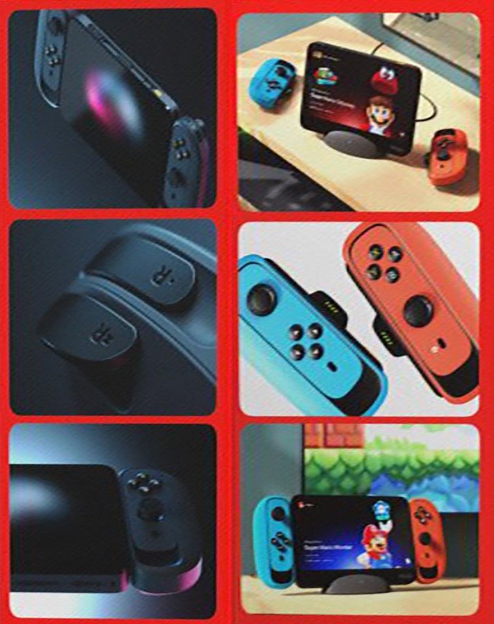
Close ups

They sound like joycons alright.The console looks fine, the Joycons look like they would slide out of your hands way too easy.

I think the idea is that the controls can slide up and down within the grip to accommodate different hand sizes/preferred joystick positions.Why are the joycons like that? I can’t figure out if they have some extra functionality
Oh. Admirable intent, ugly execution.I think the idea is that the controls can slide up and down within the grip to accommodate different hand sizes/preferred joystick positions.
Well done? Looks like a cheap clone, it's atrocious.Saw this in the hardware thread its such a well done mockup for nintendos next console what do you guys think of it?
Close ups
Oh boy, that means the Switch Z will be even rounder than the 2, and part of it will somehow float in midair without any support.Switch:
Switch 2:
They're talking about the mockup. It's well done.Well done? Looks like a cheap clone, it's atrocious.
What makes you think this?? Nintendo still ensures that most of their games support single Joy-Con controls for multiplayer, including the upcoming Pikmin 4. There’s absolutely no reason to believe Nintendo has abandoned that concept.I believe that the new left joycon will have a proper d-pad this time.
I think Nintendo has abandoned the idea of using a single joycon as a controller, so there's no reason to have buttons again.
It's there in most shots, but missing on the very first box art. It isn't even consistentand is that a CHIN bezel?

I think they're meant to be adjustable? Like, whether you want the classic parallell sticks or the Xbox-like style.Why are the joycons like that? I can’t figure out if they have some extra functionality
Every Switch 2 will come with burnt pixels in the center of the screen that spell "Switch 2"Whatever the successor is, I believe Nintendo will make it visually distinct from the Switch in a notable way. We say what happened with the Wii U “is this an add on?” confusion. You won’t be able to mistake Switch and Switch 2 on shelves.