
- Pronouns
- He/Him
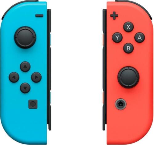
Someone probably read one of those rumors about the successor having "beefier" Joycons and then just went wild from theremay i ask what in the everloving hell is going on with those controllers?

Someone probably read one of those rumors about the successor having "beefier" Joycons and then just went wild from theremay i ask what in the everloving hell is going on with those controllers?
may i ask what in the everloving hell is going on with those controllers?
true! but like… why is it a small controller inside the controller? what possible gain is there for it appearing to… slide up and down?????? in that slot??Someone probably read one of those rumors about the successor having "beefier" Joycons and then just went wild from there
I think the intention is that it'd allow to switch between the classic parallell sticks configuration and the modern xbox-styled shifted sticks while in handheld mode?true! but like… why is it a small controller inside the controller? what possible gain is there for it appearing to… slide up and down?????? in that slot??
hard agreeCan’t say I like it much but I’m so happy we’re in the fanmade mock-up era of speculation. Always the most fun part of the lead up to any Nintendo system for me.
i believe the idea is that the box on the left is for a "Switch 2 —Max—" which is why the design is different lolIt's there in most shots, but missing on the very first box art. It isn't even consistent
I think the idea behind it is to allow existing joycons to be compatible with a larger machine.true! but like… why is it a small controller inside the controller? what possible gain is there for it appearing to… slide up and down?????? in that slot??
I think the intention is that it'd allow to switch between the classic parallell sticks configuration and the modern xbox-styled shifted sticks while in handheld mode?
I slightly prefer the shifted sticks but the Wii U Pro-Controller felt really great, I agree.Might be in the minority here, but the Wii U Pro Controller has one of the best layouts, even beating the GCN controller. I would LOVE to have another controller where the analog sticks are on top. It’s one of the many reasons why I love using the Steam Deck. Feels absolutely phenomenal in the hands.
It seems like the idea behind this "gimmick" is to make the position of the controls adjustable, primarily for single joycon play. So if you have the right joycon you can slide the controls to the left so it's more comfortable to grip?Is the inner part of the joycon supposed to be removable? What is going on there
I thought immediately that it was to make a better grip and have old Joycon be compatible.Is the inner part of the joycon supposed to be removable? What is going on there
I don't expect them to be compatible physically but do think there's a solid chance you'll be able to use them wirelessly.I thought immediately that it was to make a better grip and have old Joycon be compatible.
What are you guys’ and gals’ thoughts on that???
Will current Joycon be compatible or incompatible with the new hardware??
Update
Update
Update
You may but they will not answermay i ask what in the everloving hell is going on with those controllers?
Same here, but my reaction to the hardware was "can you please don't"I like the UI and the screen but also no.
Without even getting into the terrible dock and whatever the hell is going on with those Joy-Con, I don’t understand how someone can go through all the effort to make an elaborate mock-up like this with the intention of it looking real, only to get some obvious details wrong that would be super easy to check and avoid. Like, “The Legend Of Zelda: Tears Of The Kingdom”—“of” and “the” shouldn’t be capitalized here and aren’t on the official title.
Also, while it’s neat how the foreground elements and logo pop out of a game’s icon when selected on the HOME Menu, there’s no way this would actually be a thing, at least not with old games, because they’d have to go back and manually make new special icons like this for every game, though that’s less of a mistake and more of an impractical change that would never happen I guess.
Always wear underwear when viewing things on the internet or cover your genitals with a newspaper for god sake.I threw up on my balls seeing the Joycon.
nah, they'll have a different color =PSo anyway, here's what the next generation joycons are going to look like
I think it would be cool as a first time thing but yeah lol at the idea of it doing that everything you put in a cartridge“Nintendo Shop”
“Super Mario Wonder”
lol
Also, how could they possibly think that, after putting a game card in, having to watch a slow animation and then have the game appear in the middle of the other icons on the HOME Menu would be an improvement?? Not to mention that HOME Menu is just unnecessarily flashy (and seemingly less snappy), and, as I previously pointed out, there’s no way dynamic icons like that would be a thing for older software because it would require a new icon to be made for literally every game, which would never happen.
NGL, I'm hoping all of this is building up to some insane Nintendo On-style video. Dude is already putting too much effort into this not to go all the way and have some five-minute showcase video detailing the controllers and the UI.Same energy:

Original Poster is teasing something
/cdn.vox-cdn.com/uploads/chorus_image/image/49163473/nintendo_nx_fake.0.0.jpg)