
-
Hey everyone, staff have documented a list of banned content and subject matter that we feel are not consistent with site values, and don't make sense to host discussion of on Famiboards. This list (and the relevant reasoning per item) is viewable here.
-
Furukawa Speaks! We discuss the announcement of the Nintendo Switch Successor and our June Direct Predictions on the new episode of the Famiboards Discussion Club! Check it out here!
You are using an out of date browser. It may not display this or other websites correctly.
You should upgrade or use an alternative browser.
You should upgrade or use an alternative browser.
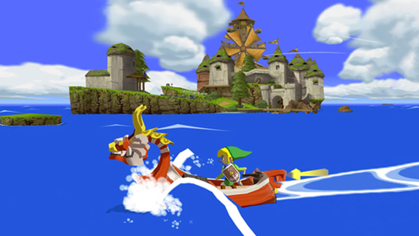
Discussion Do you prefer the look of Wind Waker or Wind Waker HD?
- Thread starter YolkFolk
- Start date

- Pronouns
- He/Him
I think both look good, I prefer Wind Waker because the toon shading is consistent with the original intention and is more cohesive overall. HD cranks up the bloom which I think is fitting for 'bright and sunny', and it resembles more of a claymation look, but it can expose the underlying low detail of the models that the original was able to disguise better.

B. Spaceman
The Baby
Original by far
BlackthornOrion
#theprocessworks
Both are good, but given a choice I'd go with HD probably 7 times out of 10
HotelSyrup
Piranha Plant
- Pronouns
- Him
Prefer HD by a lot
- Pronouns
- He/Him
I think the OG is timeless but honestly I like both of them.
Link_enfant
Fashion dreamer
- Pronouns
- They/Them
HD clearly and I’m tired of feeling so alone on this boat. 
Edit: pun absolutely not intended, just realized haha
also not feeling so alone anymore
Edit: pun absolutely not intended, just realized haha
also not feeling so alone anymore
Wind Waker. HD has some good quality of life improvements but it is downright ugly. That and compromising the Triforce quest are two reasons for me to replay the original if I want to play Wind Waker.
Hero of Hyrule
Frieren the Slayer
- Pronouns
- He/Him
Both look fantastic
The OG looks better
The OG looks better
Steve
Chain Chomp
- Pronouns
- he/him
I personally like both, but for different reasons.
GameCube version looks unbelievable good for its time, it’s probably one of the best looking 6 gen game and the colours really pops.
Meanwhile the HD version looks clean and sleek and make has made the game a timeless classic.
It’s a shame that WW art style was hated, since it’s truly remarkable, I think it’s a shame that it’s aonuma favourite style and it’s probably the game he wanted to make the most, it’s truly shame that early 2000s people really didn’t want thing to look kiddy and cartoony, it’s probably one of the factor of the GC failures, mostly because people were self conscious of liking things that looks kiddy.
Sorry for the rant, but WW really was done dirty by the consumer and hardcore gamers, since WW has a surprisingly good story and has one of the best iteration of Ganon.
Stilt Village
GBA
The bloom is a crime
OP
OP
YolkFolk
Tingle
I personally like both, but for different reasons.
GameCube version looks unbelievable good for its time, it’s probably one of the best looking 6 gen game and the colours really pops.
Meanwhile the HD version looks clean and sleek and make has made the game a timeless classic.
It’s a shame that WW art style was hated, since it’s truly remarkable, I think it’s a shame that it’s aonuma favourite style and it’s probably the game he wanted to make the most, it’s truly shame that early 2000s people really didn’t want thing to look kiddy and cartoony, it’s probably one of the factor of the GC failures, mostly because people were self conscious of liking things that looks kiddy.
Sorry for the rant, but WW really was done dirty by the consumer and hardcore gamers, since WW has a surprisingly good story and has one of the best iteration of Ganon.
People were basically expecting Twilight Princess visuals to fit in with the ‘cool kids’ vibe that existed back then.
Then they were met with this:
- Pronouns
- Any
OG by far. Everything looks so bold and saturated. HD on the other hand looks washed out and OD'd on bloom lighting.
OctoSplattack
Tingle
- Pronouns
- He/Him
I like HD more overall. There are definitely places where the new lighting just doesn't work, but there are more than enough places where it looks good-to-gorgeous that I can forgive it.
Ricimer
Bob-omb
- Pronouns
- She/Her
I personally like both, but for different reasons.
GameCube version looks unbelievable good for its time, it’s probably one of the best looking 6 gen game and the colours really pops.
Meanwhile the HD version looks clean and sleek and make has made the game a timeless classic.
It’s a shame that WW art style was hated, since it’s truly remarkable, I think it’s a shame that it’s aonuma favourite style and it’s probably the game he wanted to make the most, it’s truly shame that early 2000s people really didn’t want thing to look kiddy and cartoony, it’s probably one of the factor of the GC failures, mostly because people were self conscious of liking things that looks kiddy.
Sorry for the rant, but WW really was done dirty by the consumer and hardcore gamers, since WW has a surprisingly good story and has one of the best iteration of Ganon.
People were basically expecting Twilight Princess visuals to fit in with the ‘cool kids’ vibe that existed back then.
Then they were met with this:
I'm bored at work so I'll play devil's advocate to WW's backlash: It's important to remember WW was the successor to OoT and MM, two games with pretty realistic and gritty artstyles.
Imagine you're a teen/young adult Zelda fan in 2001. The PS2 and Xbox just hit the scene and more "mature" games like GTA 3 and MGS2 shaking the industry after 15 years of games mostly aiming at younger audiences, You loved OoT/MM and are hyped for the next Zelda after seeing the 2000 SpaceWorld tech demo. Nintendo is known for their all-ages, accessible franchises like Mario, but Zelda has been a a bit of an exception in their lineup: bigger scopes, more sophisticated, industry-leading gameplay, and grittier artstyles in their 3D games.
And then "Celda" gets revealed and it's the opposite of all that: Nintendo is ostensibly doubling down on making games for the kid audience while the rest of the industry is moving in a new, interesting direction.
I'm not saying obviously dumb vitriolic hate was justified. But given the historical context, the backlash made sense and I would dare say was justified. Nintendo pivoting to Twilight Princess's style was 100% the right move, and I think that's reflected in that game's greater success and reception.
Imagine if Zelda made an similarly extreme pivot now: Currently the series is known for its experimentation with unique art styles. But imagine if the series made a pivot to the hyper-realistic Western AAA graphics (e.g. The Elder Scrolls); a tired artstyle that's been the aim of the industry for the last 15 years. Would the backlash to the pivot by longtime Zelda fans be justified? I would say so.

bashfluff
Cappy
- Pronouns
- He/him
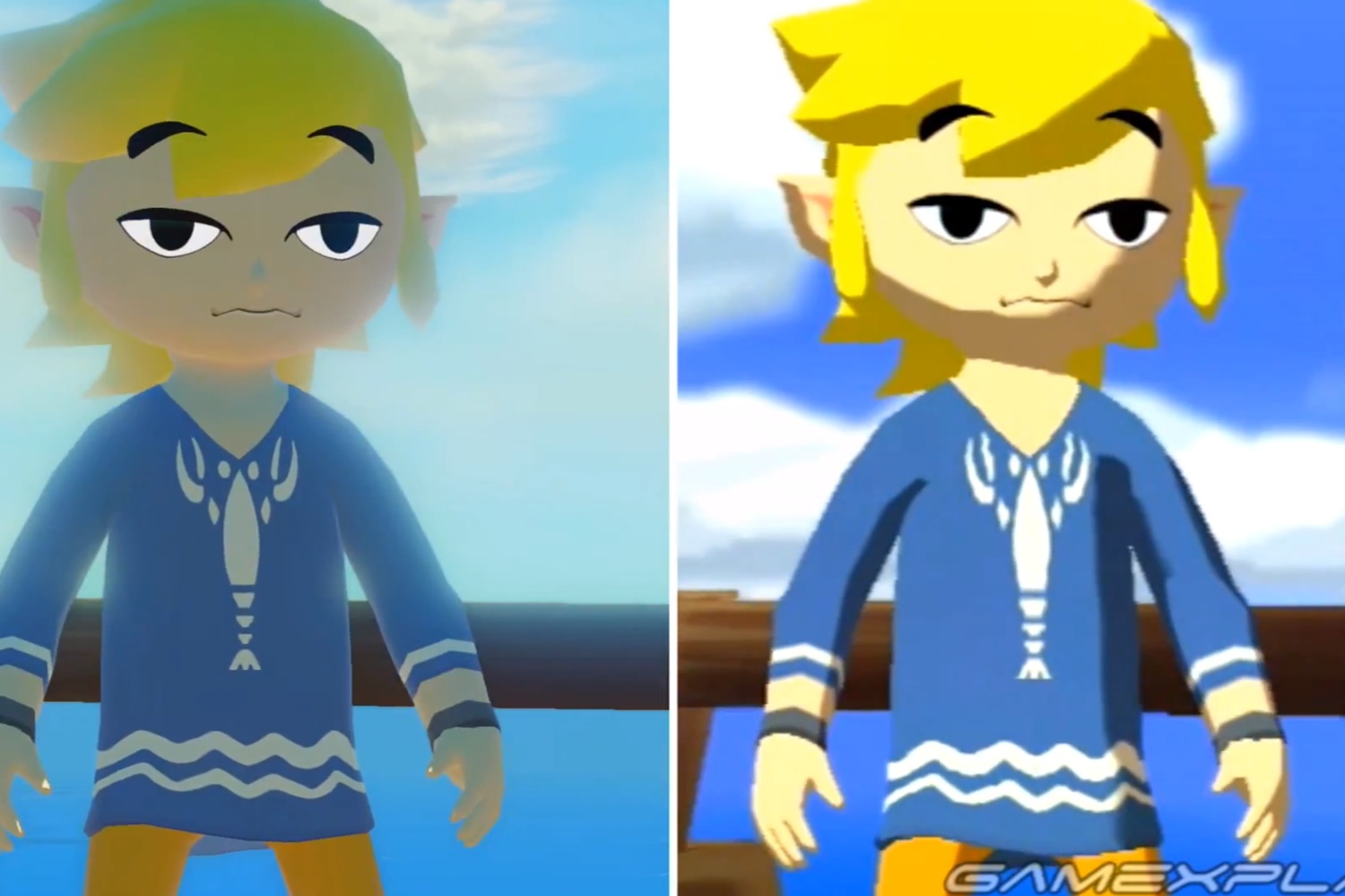
MatthewMatosis once said that the HD Link looks like a Nintendo Mii. I’ve never been able to unsee it.
Then he showed what the original game would have looked like rendered at a higher resolution and in widescreen, and compared it to the original. The original looked much better, imo.
Then he showed what the original game would have looked like rendered at a higher resolution and in widescreen, and compared it to the original. The original looked much better, imo.
Linkstrikesback
Bounty Hunter
- Pronouns
- He
I personally like both, but for different reasons.
GameCube version looks unbelievable good for its time, it’s probably one of the best looking 6 gen game and the colours really pops.
Meanwhile the HD version looks clean and sleek and make has made the game a timeless classic.
It’s a shame that WW art style was hated, since it’s truly remarkable, I think it’s a shame that it’s aonuma favourite style and it’s probably the game he wanted to make the most, it’s truly shame that early 2000s people really didn’t want thing to look kiddy and cartoony, it’s probably one of the factor of the GC failures, mostly because people were self conscious of liking things that looks kiddy.
Sorry for the rant, but WW really was done dirty by the consumer and hardcore gamers, since WW has a surprisingly good story and has one of the best iteration of Ganon.
Wind waker was the 4th best selling game on the GameCube. The idea that it was 'done dirty' by consumers for its art style at the time is some revisionist history that's been pushed for the past two decades when everyone realised quickly that it looked great, that i can only assume is ignoring that the rest of the game is much worse than all of the other 3d zeldas. Maybe not skyward sword I guess.
There's a reason whenever anyone brings up anything about wind waker, it's the final cutscene with ganon because the dungeons are terrible, there are a total of two actual new dungeon items in the game (and calling the grappling hook an item is overly generous really), with everything else being ripped directly from OOT or MM for the exact same puzzles but worse, the most barren overworld in series history, the weakest dungeons, it's the game that switched the 3d series to being heavily linear despite people being mislead by the overworld tbst they had any freedom at all. The presentation is all it actually has going for it
OP
OP
YolkFolk
Tingle
I'm bored at work so I'll play devil's advocate to WW's backlash: It's important to remember WW was the successor to OoT and MM, two games with pretty realistic and gritty artstyles.
Imagine you're a teen/young adult Zelda fan in 2001. The PS2 and Xbox just hit the scene and more "mature" games like GTA 3 and MGS2 shaking the industry after 15 years of games mostly aiming at younger audiences, You loved OoT/MM and are hyped for the next Zelda after seeing the 2000 SpaceWorld tech demo. Nintendo is known for their all-ages, accessible franchises like Mario, but Zelda has been a a bit of an exception in their lineup: bigger scopes, more sophisticated, industry-leading gameplay, and grittier artstyles in their 3D games.
And then "Celda" gets revealed and it's the opposite of all that: Nintendo is ostensibly doubling down on making games for the kid audience while the rest of the industry is moving in a new, interesting direction.
I'm not saying obviously dumb vitriolic hate was justified. But given the historical context, the backlash made sense and I would dare say was justified. Nintendo pivoting to Twilight Princess's style was 100% the right move, and I think that's reflected in that game's greater success and reception.
Imagine if Zelda made an similarly extreme pivot now: Currently the series is known for its experimentation with unique art styles. But imagine if the series made a pivot to the hyper-realistic Western AAA graphics (e.g. The Elder Scrolls); a tired artstyle that's been the aim of the industry for the last 15 years. Would the backlash to the pivot by longtime Zelda fans be justified? I would say so.
You’re completely correct.
It was an awful decision tbh and completely tone deaf to how the market had developed.
Last edited:
Stilt Village
GBA
I generally agree, but I don't think the bolded is fair.Wind waker was the 4th best selling game on the GameCube. The idea that it was 'done dirty' by consumers for its art style at the time is some revisionist history that's been pushed for the past two decades when everyone realised quickly that it looked great, that i can only assume is ignoring that the rest of the game is much worse than all of the other 3d zeldas. Maybe not skyward sword I guess.
There's a reason whenever anyone brings up anything about wind waker, it's the final cutscene with ganon because the dungeons are terrible, there are a total of two actual new dungeon items in the game (and calling the grappling hook an item is overly generous really), with everything else being ripped directly from OOT or MM for the exact same puzzles but worse, the most barren overworld in series history, the weakest dungeons, it's the game that switched the 3d series to being heavily linear despite people being mislead by the overworld tbst they had any freedom at all. The presentation is all it actually has going for it
Wind Waker revolutionized how Zelda puzzles worked, and remained pretty unique for its heavy emphasis on environmental interaction stuff until Breath of the Wild came out and made things like cutting the bridge in Dragon Roost Caverns or stealing an enemy's weapon to light it on fire and throw it at a wooden barricade seem quaint. It made far more interesting use of the Mirror Shield than any other game, did different things with the Hookshot and Iron Boots, gave Bombs a new function as ammo for the cannon, gave the Boomerang a multi-targeting ability and some actual use after it was basically just for collecting tokens in OoT, ditto for the hammer which was also barely used in OoT... Later incarnations are better, and I think I'd say this is the Hookshot's weakest 3D showing overall because it comes real late, but they did at least a little to keep things fresh.
Aside from the Earth and Wind Temples, none of the dungeons hold up very well, but it does deserve credit for being the game where they committed to fully theming the dungeon's contents to the environment and having evolving puzzle concepts that run throughout them, finally shedding the "here's some switches or whatever" thing that was still the norm for the N64 games, where each individual room of a dungeon was pretty random. Twilight Princess and Skyward Sword largely did this stuff much better, but Wind Waker did invent it.
Prophet64
Moblin
- Pronouns
- They/Them
If this gets another re-release, remaster, remake, or whatever, I'd like for Nintendo to take another run at what the game should look like, which should be more crispy, colorfulness of the OG rather than the washed out and strange effects some of the lighting have on the models.
GAP
Piranha Plant
The original. The HD can actually look quite ugly at times and much better at others but the OG keeps itself very consistent and better on the whole. I really don’t like what they did to the sea and to lights (like Moblin lamps) in the HD one, for example.
Shame because I like the small gameplay tweaks they make in the HD quite a bit except for the quirk (or maybe feature) where the same slash can hit an enemy twice sometimes
Shame because I like the small gameplay tweaks they make in the HD quite a bit except for the quirk (or maybe feature) where the same slash can hit an enemy twice sometimes
APileofBananas
Octorok
- Pronouns
- He/Him
Bloom defenders get in here!
Clov
An ethernet cable girlfriend
- Pronouns
- She/Her
I'm bored at work so I'll play devil's advocate to WW's backlash: It's important to remember WW was the successor to OoT and MM, two games with pretty realistic and gritty artstyles.
Imagine you're a teen/young adult Zelda fan in 2001. The PS2 and Xbox just hit the scene and more "mature" games like GTA 3 and MGS2 shaking the industry after 15 years of games mostly aiming at younger audiences, You loved OoT/MM and are hyped for the next Zelda after seeing the 2000 SpaceWorld tech demo. Nintendo is known for their all-ages, accessible franchises like Mario, but Zelda has been a a bit of an exception in their lineup: bigger scopes, more sophisticated, industry-leading gameplay, and grittier artstyles in their 3D games.
And then "Celda" gets revealed and it's the opposite of all that: Nintendo is ostensibly doubling down on making games for the kid audience while the rest of the industry is moving in a new, interesting direction.
I'm not saying obviously dumb vitriolic hate was justified. But given the historical context, the backlash made sense and I would dare say was justified. Nintendo pivoting to Twilight Princess's style was 100% the right move, and I think that's reflected in that game's greater success and reception.
Imagine if Zelda made an similarly extreme pivot now: Currently the series is known for its experimentation with unique art styles. But imagine if the series made a pivot to the hyper-realistic Western AAA graphics (e.g. The Elder Scrolls); a tired artstyle that's been the aim of the industry for the last 15 years. Would the backlash to the pivot by longtime Zelda fans be justified? I would say so.
Just seeing this now, and I completely disagree! Nintendo took Zelda from looking plain to looking cool with WW, and gamers didn't like it at the time because they had bad taste. The industry wasn't moving in an interesting direction at all; it was getting dull! Nintendo course corrected and made TP to try and appease these gamers... and ended up creating an hideous looking mess that aged like milk! The original WW in the meantime, still looks fantastic.
Was the backlash to WW justified at all? Not even close. We have to be honest with ourselves here; the same people who hated WW for its adorable style were also the same people who hated Tingle's appearance in the game. And as we all know, those people are total losers!
Zelda is simply best when it looks cute, and the original WW is up there with the Link's Awakening remake in having the best style in the series!
- Pronouns
- he / him
Unless you think the quick sail looks amazing, it doesn't really match the question.The HD version doesn’t have enough issues to negate the inclusion of the quick sail. So HD wins.
- Pronouns
- He/Him
If anyone wants QoL improvements like the Swift Sail but the original visuals, here's a good patcher.

 github.com
All toggles:
GitHub - WideBoner/betterww: Better Wind Waker
Better Wind Waker. Contribute to WideBoner/betterww development by creating an account on GitHub.
github.com
All toggles:
- Swift Sail replaces Sail
- Brisk Sail (faster swift sail)
- Instant text boxes
- Faster block moving
- Faster grapple hook
- Faster rolling speed
- Faster crawling, climbing, NPC chat zoom
- Tingle chests without tingle tuner
- Turn while swinging or grappling
- Faster ballad of gales
- No song replays
- Remove intro video
- Invert camera
- Unrestricted boat
- Reveal full sea chart
- Random Enemy Colors
Mer.Saloon
Tingle
- Pronouns
- He/Him
I like both. The bloom may be excessive, but a lot of the gradiants in the backgrounds is so beautiful.
Is this similar to those Mario 64 mod videos that explain how coding refinements could push N64 games even further?
Have they ever explained how they got the Swift sail to work on real hardware? As it's been said, loading on the OG gamecube prevented the sailing from going faster, but these modders managed to patch it in to the OG.If anyone wants QoL improvements like the Swift Sail but the original visuals, here's a good patcher.
GitHub - WideBoner/betterww: Better Wind Waker
Better Wind Waker. Contribute to WideBoner/betterww development by creating an account on GitHub.
All toggles:
Works on both real hardware and Dolphin. There's a proper widescreen patch as well, linked in the repo, that actually pushes the HUD to the sides.
- Swift Sail replaces Sail
- Brisk Sail (faster swift sail)
- Instant text boxes
- Faster block moving
- Faster grapple hook
- Faster rolling speed
- Faster crawling, climbing, NPC chat zoom
- Tingle chests without tingle tuner
- Turn while swinging or grappling
- Faster ballad of gales
- No song replays
- Remove intro video
- Invert camera
- Unrestricted boat
- Reveal full sea chart
- Random Enemy Colors
Is this similar to those Mario 64 mod videos that explain how coding refinements could push N64 games even further?
If I thought the HD version looked atrocious, then I wouldn’t think the QOL features made up for it. But I liked the HD version enough that having those QOL features didn’t really make me consider looking too deeply into the differences between them. I have trouble focusing on the visual differences because some of the gameplay differences overshadow them in my view. That’s all I mean by it. I answered both.Unless you think the quick sail looks amazing, it doesn't really match the question.