• Hey everyone, staff have documented a list of banned content and subject matter that we feel are not consistent with site values, and don't make sense to host discussion of on Famiboards. This list (and the relevant reasoning per item) is viewable here.
  • Furukawa Speaks! We discuss the announcement of the Nintendo Switch Successor and our June Direct Predictions on the new episode of the Famiboards Discussion Club! Check it out here!

Discussion Would this leaked Switch 2 UI be near ideal?

Status
Not open for further replies.

Tamndrew11

Rattata
Banned


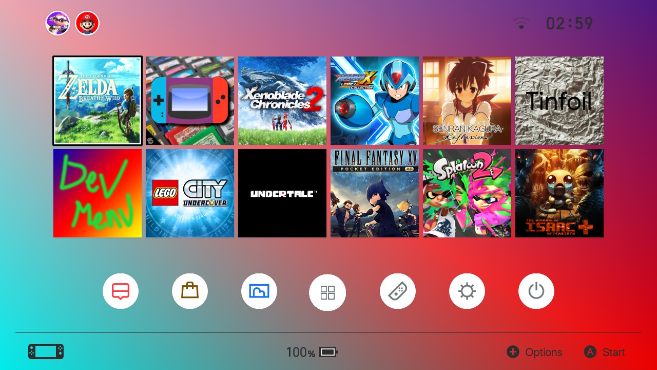
I posted about this leak earlier, and while I'm not here to talk about the legitimacy of these images in wondering if this UI would be seen as ideal by Nintnedo fans.

My only complaint would be the ads at tye bottom of the screen.... just, why? But other than that, I hope the menu for Switch 2 looks like this.
 
Quoted by: Tye
1
If you really just want to talk about what people would like to see in the console's UI design, you can do so in the Nintendo Switch 2 Speculation Thread, rather than make a thread centered on a fake leak.

 
If you really just want to talk about what people would like to see in the console's UI design, you can do so in the Nintendo Switch 2 Speculation Thread, rather than make a thread centered on a fake leak.

Thank you, I was looking for a thread like this but I couldn't find it. Sorry if I shouldn't have posted about this twice
 
0
ads at tye bottom
Ads on my what?!

Seriously, though…no, just no. This looks absolutely terrible, runs counter to Nintendo’s design philosophy, and is worse than the current Switch HOME Menu all around. Also, whoever made this mockup clearly forgot to accommodate more than a single account per system in the UI, lol.
 
OK, I am not super techy, but I want them to maintain the minimalistic look of the current Switch if that means they can squezze more performance.
 
0
It's okay.

I'm not a fan of the iconification of menus at all. Steam has the perfect UI for me. It puts everything I actually use right in my face. Everything else is tucked away in visible but less prominent menus. That's the way it should be.
 
Ads on my what?!

Seriously, though…no, just no. This looks absolutely terrible, runs counter to Nintendo’s design philosophy, and is worse than the current Switch HOME Menu all around. Also, whoever made this mockup clearly forgot to accommodate more than a single account per system in the UI, lol.
I disagree a bit, this menu looks WAY better than the Switch's menu. If thus menu is bad that also means the PS5 menu and Xbox menus are also bad, and I don't think that's the case. When it comes to visuals this menu blows the Switch out of the water.

I'm still not a fan of the ads though. Also, Switch is the only system currently that has multiple accounts on display at once. With PS5 and Xbox, you have to log out and log in with another account. I assume that's how this menu would work, which is in line with most UI's currently
 
no thanks, I already have (and don’t like the UI of) Xbox

Honestly don’t change it. Just give me the current Switch UI again.
 
I prefer the UI from a famous fake Switch2 video I saw before. It places your current game in the center and zooms in.
 
0
A thread on this tweet has already been closed. This looks like a pretty transparent attempt to open another.
I'm sorry if it comes across that way. I'm not trying to circumvent the closure of the previous thread. I'm just wanting to have a discussion about the overall design and how well received this would be, not whether or not it's real.
 
0
Here before this gets locked again.

Before that happens.

1. This is a bad edit of the current Xbox home screen.

2. No, this would be awful, the current one is already ideal.
 
Nope looks awful. Second row of icons are completely useless. Plus it's not a well made mockup, as those pointed out on twitter, Nintendo doesn't use that font anywhere.

We need 3DS home screen back. Some of us have more than 500 game icons on their platform and only grid system is a solution to that mess. Grid with adjustable icon sizes.
 
That you managed to find a twitter post with basically no view and within minutes somehow create a new account and make a post with a bunch of additional information that's isn't in the original post in the other thread make me think this design is done by you. Plus how much you are defending this design.

It's fine to just post a mockup and ask for people's opinion you know? You don't have to make up a story of a leak to get attention.
Somebody posted this on Discord in minutes of the post being made, that's how I found this. I don't use forums, so I searched gaming forums and found this site and made an account to post. I work a full time job, I don't have time to create designs like this, make multiple variations and then make up stories about it. I just found this online, and decided it would be a neat discussion.
 
Looks like Xbox offset left lol for the top bars stuff. I think switch 2 UI will be very similar to switch 1 just with gaming related themes instead of just light and dark mode
 
0
It wouldn't look good on a small display at all. You have to keep in mind that the Switch UI is inherently simple so it's optimized for portability. Not to mention it's obviously a rehash of the Xbox Dashboard. Something closer to the PS4 UI would befit more for a Switch 2 UI.
 
The resolution of this image is bigger than 4K and obviously fake. It's ridiculous.
The Switch 1 home menu is 720p, so the Switch 2 home menu would be 1080p at most.
 
0
switch-homebrew-custom-home-menu-sept222018-6.jpg
Something like this honestly is what I expect
 
Somebody posted this on Discord in minutes of the post being made, that's how I found this. I don't use forums, so I searched gaming forums and found this site and made an account to post. I work a full time job, I don't have time to create designs like this, make multiple variations and then make up stories about it. I just found this online, and decided it would be a neat discussion.

So if there's already a discussion on this over at Discord and you don't use forum, why change that now? Why not continue the conversation over at this earlier identical thread at a bigger forum?
 
0
my wishlist
  1. lite. doesn't need to include to many unnecessary functions. we all got phone now.
  2. fast. again, I don't need any system level functions other than play games. some specific functions could be achieved by standalone app or phone.
  3. fix NSO & eShop laggy issues. only compliant of the current Switch UI.

other than that, Nintendo developers, you could have fun.
 
0
You've already posted this same fake leak earlier and the thread got locked. Please do not open threads for "leaks" from dubious sources. - Lord Azrael, IsisStormDragon, meatbag
 
Status
Not open for further replies.


Back
Top Bottom