
- Pronouns
- She/Her
Never mind Fire Emblem, never mind Silksong, never mind 3D Mario. Where the hell is the flapper?
For those unfamiliar with it, a flapper is a sort of mark, or sticker, that is often attached to a bigger object, kind of like the laundry instructions sticking out of a t-shirt. The flapper is what Nintendo have been using on their YouTube thumbnails, showing the logo in the usual red-white colour scheme. I've always liked the flapper, it makes the thumbnails look distinct, which makes sense, given that that is their purpose.
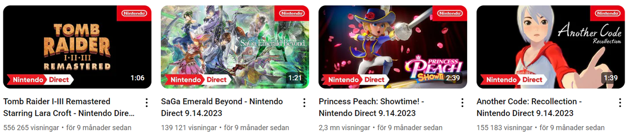
They've had different looks over the years - recently, the flapper is on the upper-right corner, while it has had more rounded corners in the past.

My favourite is probably the one from 2019-2020, when it came in from the left and sort of "pushed in" the thumbnail. It looked great, and really gave a flavour to the thumbnails.

HOWEVER.
On the videos from this year's Directs - both this one and the Partner Showcase - there is no flapper. It's there on other videos, but on the Direct videos, it's nowhere to be seen.

This sucks. Where is it?!
For those unfamiliar with it, a flapper is a sort of mark, or sticker, that is often attached to a bigger object, kind of like the laundry instructions sticking out of a t-shirt. The flapper is what Nintendo have been using on their YouTube thumbnails, showing the logo in the usual red-white colour scheme. I've always liked the flapper, it makes the thumbnails look distinct, which makes sense, given that that is their purpose.
They've had different looks over the years - recently, the flapper is on the upper-right corner, while it has had more rounded corners in the past.
My favourite is probably the one from 2019-2020, when it came in from the left and sort of "pushed in" the thumbnail. It looked great, and really gave a flavour to the thumbnails.
HOWEVER.
On the videos from this year's Directs - both this one and the Partner Showcase - there is no flapper. It's there on other videos, but on the Direct videos, it's nowhere to be seen.
This sucks. Where is it?!

 I guess they just felt the company logo was redundant with the Direct banner