• Hey everyone, staff have documented a list of banned content and subject matter that we feel are not consistent with site values, and don't make sense to host discussion of on Famiboards. This list (and the relevant reasoning per item) is viewable here.

Discussion Games that look worse than their predecessors?

Yzz

Like Like
Pronouns
She/Her
There's the famous cases like Wind Waker to Twilight Princess (massive shift in art direction), FFVI to FVII (2D to primitive 3D), Dragon Quest VIII to IX (where the hardware became significantly weaker). But I think it's more interesting to review the cases where the hardware and art direction didn't change a lot.

In Mario Kart discussion it is widely agreed that Double Dash looks better than MK Wii, despite both of them being in similar hardware.


In this case, MK Wii looks kinda bad because of the unsaturated colors and stiffer animations. It tries to achieve the vinyl figure look that was also implemented in MK8, but the Wii hardware wasn't good enough to make it justice, as a result the characters look plastic-ish in a bad way. Some people also say that the MK Wii models look more jaggy, but I think this could be said about both games.

In what other cases does the sequel look worse?
 
Last edited:
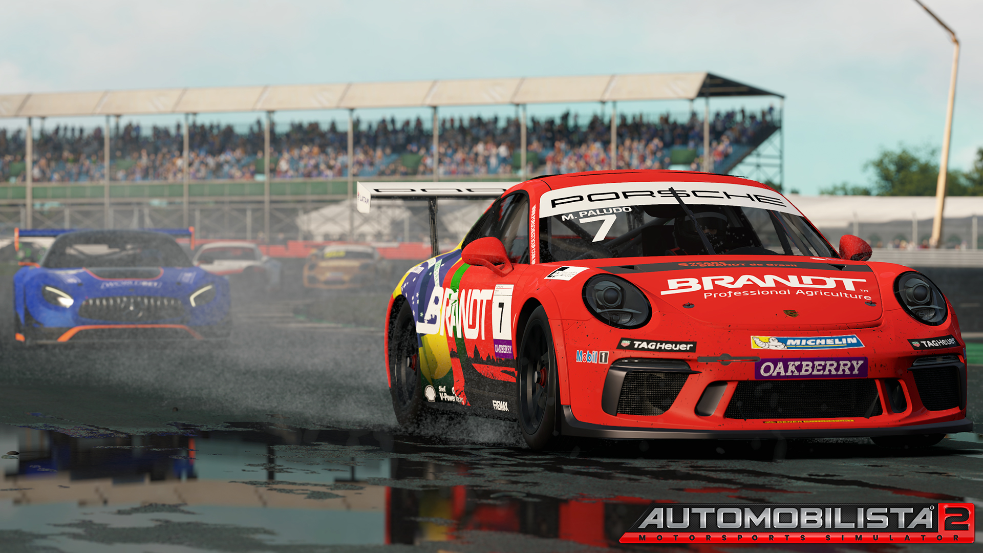
Project Cars 3.

Not a Nintendo game but yeah, shame about the final product.

Can't find decent comparison screenshots right now, will try later.
 
Twilight Princess by a pretty wide margin. I guess it's much more a style preference but Wind Waker just always looked so much better.
 
I may catch heat for this, but I think I still prefer how Metroid Fusion looks, over Dread. While Dread has many visual benefits over Fusion (the 3D, sublime, dynamic boss counters, for example), high quality pixel art is still a beauty to behold.

Neo_Ridley_Animation.gif
 
The art direction in BDSP really just isn't doing anything for me, especially compared to the original game.
 
0
The Marvel vs Capcom series has gone downhill graphically. Gorgeous pixel art for the first, still pixel art but mixed with bad 3D backgrounds on the second, awkward 3D models for everything in 3, and Infinite lol
 
This is probably an unpopular opinion, but I don't think I'll ever get the praise for Halo 4's visuals over Reach's. To this day it's probably the only time I've seen an Xbox game get praised on the same wavelength as a top tier Playstation game (just me personally, I imagine it happened with Gears of War 1 because it was an Unreal Engine showcase, but I wasn't really gaming like that back then). And I ... kind of don't get it?

Ok, the vistas that need to be REALLY BRIGHT, are bright, have great lighting, and are gorgeous. The problem is the ENTIRE GAME is bright, even when it doesn't make sense, and everything has this weird mixture of washed out colors for the environment but heavy bloom for weapons/effects. It's just so overwhelming how bland it can look at times.

Meanwhile Reach has a lot of contrast, a lot of different tones and moods, some really detailed texture work (I honestly think most of the textures are far more detailed than Halo 4's, particularly the weapons and environments), and just better art direction overall.

I'd post screenshosts, but all I can really find at a glance is E3 Halo 4 stuff, which obviously isn't as representative, and in general screenshots don't tend to do games justice. It is funny, for how much I hear praise over Halo 4's graphics, it seems Halo Reach's art style is what has been talked about enough in hardcore Halo circles to make 343 mostly take from that pool more than any other game.

I guess another game in the Halo series is kind of like this, though I must stress it's only in certain aspects. In some ways, I think Halo 2 has aged quite a bit worse than Halo: CE. Yes, Halo 2 is one of the best looking games of the 6th generation when it comes to geometric complexity and texture work. But the colors in that game .... A LOT of the game is very drab and ugly. From what I remember, Halo 2 was originally supposed to implement a complex lighting system, which ended up being too much for the Xbox on top of the already graphically demanding base Halo 2 game. So it's probable that the actual game was supposed to be a lot more bright and colorful.
 
I may catch heat for this, but I think I still prefer how Metroid Fusion looks, over Dread. While Dread has many visual benefits over Fusion (the 3D, sublime, dynamic boss counters, for example), high quality pixel art is still a beauty to behold.

Neo_Ridley_Animation.gif
Yeah, I agree with this.

Though honestly, Zero Mission also doesn't look quite as visually interesting as Fusion, I think.
 
Final Fantasy Origins is an upcoming Nioh reskin and looks and runs worse than Nioh 2. 😂 The gameplay is again very good though.
 
0
Diamond and Pearl remakes for me. I really wanted the remakes to use the tall character models they've been using since Gen 7. The chibi 3d here doesn't look very good to me so the sprites just look better.
 
0
Most N64/PSone games compared to Genesis/SNES, but just because it was a new tech, a new gen and the start of 3D.
 
0
ZM looks way better than Fusion, imo.
I think both have about the same visual fidelity, with a slight edge to Zero Mission. I played both on emulators with the screen stretched, though. From what I remember Zero Mission is cleaner and also I think has a bigger area of view (as in, Samus is smaller proportional to the view of the entire screen). Fusion is closer in and less clean, but also has some very striking weird visuals.

Hence, I don't think either game belongs in this thread. I just remember Fusion looking a bit more interesting than Zero, art design wise. I think once you get to Super - Zero, they all excel at different things and I honestly couldn't pick what is the best looking (no, Super is not the clear winner imo).

I honestly think what the Metroid devs did with Super Metroid, Fusion and Zero Mission constitutes some of the absolute best pixel art ever made by a developer.

Super Metroid obviously set a high bar, and a lot of what it did is still unparalleled (the incredible pixel depth on her armour segments during idle animations, the sheer complexity of having her entire moveset animated out with appropriate animations for whether her gun arm is left or right). However, what R&D1 did on the GBA is absolutely incredible: They not only kept all the same complexity in Samus' sprite animations in Fusion and Zero Mission, they worked around the limitations of the GBA screen by making the colours 'pop' more, giving more outline and definition to platforms and obstacles, and making animations such as the save station so much more vibrant.

They may not have the same ostentatious "wow" factor as something like Metal Slug, but the amount of design and detail that went into the three games visuals is insane.
 
0
Ha, wow, I entered this thread getting ready to post about ugly-ass MKWii! I didn't know that it was apparently so widely agreed that it looks worse (so much worse) the Double Dash lol. I'll give another - possibly unpopular - Wii-related opinion of mine, then: I think the art direction of most Wii games (1st and 3rd party) looks godawful and bland, which is strange considering how good many GC games look to this day. A few examples of Wii games that look worse than predecessors off the top of my head: Super Paper Mario, Skyward Sword (I think both WW and the admittedly poorly aged TP artstyle look better), Smash Bros Brawl, and (hot take alert!) the Galaxies. Now, the Galaxies are actually among the few good looking (by Wii standards) games on the console, I just think Sunshine looks waaaaaaaay better.

Outside of the Wii, Resident Evil 5 is a big one. It looks soooooo ugly compared to RE4. I also think recent 3D Sonics (Lost World, Forces) also look a lot worse than Generations, but maybe that's just me.

Oh, and also, probably imo the absolute worst visual downgrade of a direct successor of all goddamn time - Fire Emblem: Three Houses compared to Fire Emblem Echoes. Or either of the other two 3ds games.
 
0
Mainline Pokemon games for me. Like, c'mon, Black and White set a high bar with those animated sprites. In my opinion 6th Gen isn't great after 5th. Ok, 3D models and all are cool, especially since Game Freak did a great job with the Pokemon models. But I find the games lacks of charisma since 5th, even if I think it's pretty cool to play Pokemon in 3D.

Also, I'm keeping up to date on Legends Arceus. This game looks like what I always wanted for the Pokemon universe. Can't wait to play it.
 
0
Four Swords Adventures looks worse than the Wind Waker. 😋
 
0
Hmmmmm good one.
Castlevania Rondo of Blood remake on psp props (dracula x chronicles). The og looks 100 times better with the spritework. Atleast that game comes with SoTN (with extra content even and redone voice acting) and og Rondo itself so it's not too bad.
 
0
Dark Souls II looks worse than Dark Souls, though Scholar of the First Sin corrected this.
 
0
I may catch heat for this, but I think I still prefer how Metroid Fusion looks, over Dread. While Dread has many visual benefits over Fusion (the 3D, sublime, dynamic boss counters, for example), high quality pixel art is still a beauty to behold.

Neo_Ridley_Animation.gif
I mean there are an array of game where the transition from refined, experienced spritework to early, rudimentary 3D may have been impressive by the standards of that time, but today the former still holds up while the latter looks pretty rough.
 
There's the famous cases like Wind Waker to Twilight Princess (massive shift in art direction), FFVI to FVII (2D to primitive 3D), Dragon Quest XIII to IX (where the hardware became significantly weaker). But I think it's more interesting to review the cases where the hardware and art direction didn't change a lot.
I don't mean to come off as rude, but I am sure you meant Dragon Quest VIII. I do apologize if it sounds like I am calling you out.
 
The Marvel vs Capcom series has gone downhill graphically. Gorgeous pixel art for the first, still pixel art but mixed with bad 3D backgrounds on the second, awkward 3D models for everything in 3, and Infinite lol
I think MvC3 looks great. I really like the art direction they went for, and it was more consistent that MvC2 (which as a mismatch of different quality sprites).

That said, I think all Capcom and SNK 3D fighting games look worse than their previous 2D iterations. It's very hard to surpass good quality sprite work, and unless they go the GG Xrd route, I can't see that changing any soon.
 
0
This is probably an unpopular opinion, but I don't think I'll ever get the praise for Halo 4's visuals over Reach's. To this day it's probably the only time I've seen an Xbox game get praised on the same wavelength as a top tier Playstation game (just me personally, I imagine it happened with Gears of War 1 because it was an Unreal Engine showcase, but I wasn't really gaming like that back then). And I ... kind of don't get it?

Ok, the vistas that need to be REALLY BRIGHT, are bright, have great lighting, and are gorgeous. The problem is the ENTIRE GAME is bright, even when it doesn't make sense, and everything has this weird mixture of washed out colors for the environment but heavy bloom for weapons/effects. It's just so overwhelming how bland it can look at times.

Meanwhile Reach has a lot of contrast, a lot of different tones and moods, some really detailed texture work (I honestly think most of the textures are far more detailed than Halo 4's, particularly the weapons and environments), and just better art direction overall.

I'd post screenshosts, but all I can really find at a glance is E3 Halo 4 stuff, which obviously isn't as representative, and in general screenshots don't tend to do games justice. It is funny, for how much I hear praise over Halo 4's graphics, it seems Halo Reach's art style is what has been talked about enough in hardcore Halo circles to make 343 mostly take from that pool more than any other game.

I guess another game in the Halo series is kind of like this, though I must stress it's only in certain aspects. In some ways, I think Halo 2 has aged quite a bit worse than Halo: CE. Yes, Halo 2 is one of the best looking games of the 6th generation when it comes to geometric complexity and texture work. But the colors in that game .... A LOT of the game is very drab and ugly. From what I remember, Halo 2 was originally supposed to implement a complex lighting system, which ended up being too much for the Xbox on top of the already graphically demanding base Halo 2 game. So it's probable that the actual game was supposed to be a lot more bright and colorful.
The cinematics really blew people away but otherwise I agree. I had so many issues with 4. Completely lost interest in the series halfway through that game.

My easy contribution to the thread is Cardfighters Clash 2. That game was hot garbage in every category.
 
0
Most seem to prefer Xenoblade X's visuals to Xenoblade 2's. Yeah, there was an art style shift, but there was more to it than that.

For an eye roller, Okami looked better than Okamiden :p
In Mario Kart discussion it is widely agreed that Double Dash looks better than MK Wii
It is?
 
Just a few of the top of my head:

Need for Speed ProStreet > Need for Speed Undercover
  • ProStreet wasn't an amazing looking game, but it was a noticeable step forward for the series at the time, with stuff like fully rendered damage for all of the cars, not just police vehicles. Undercover took that base, and then proceeded to add lens flares, bloom, and the almighty 7th Generation Piss Filter™ to it, creating some freakish abomination that somehow looks worse than every other NFS game made that generation. Especially when it launched opposite stuff like Burnout Paradise or Midnight Club LA.
Need for Speed Hot Pursuit 2010 > Need for Speed The Run
  • On top of The Run just not being a good game, I thought it looked worse across the board than HP2010. Everything was grainy, colors looked both too saturated and washed out at the same time, all of the car models just looked worse, and everything just seemed more lifeless.
Pokémon Gen 4 > Pokémon Gen 5
  • Gen 5 graphically always felt like the awkward transition period between the mostly 2D games of Gen 4 and the full 3D games of Gen 6, and in my opinion just looked worse than either of them. Stuff like the weird zooming in it does during battles on emphasizes that these sprites were not meant to be seen close up. At least it plays far better than Gen 4, so at least it's well optimized.
 
0
Sonics, well everything after Unleashed. Forces doesn't even begin to compare itself that game. It's quite a shame.

If we even want to put it in the kicker too

Mania >>>>>>>>>> forces. Way better art direction.
 
0
Most seem to prefer Xenoblade X's visuals to Xenoblade 2's. Yeah, there was an art style shift, but there was more to it than that.

For an eye roller, Okami looked better than Okamiden :p

It is?
While I was severely disappointed with X due to its many faults in game design, needing a ton of QoL additions, and lack of auto save and progression.

I still wish that was the graphical look of the series moving forward. It's what I liked most from Xenoblade 1, the art style with the British voice acting. It just gave a charm I don't see in games. And they got rid of it all over time to this cel-shaded look I'm just not a fan of.

It's prettier in some cases, it's just not what I want from the series.
 
I mean there are an array of game where the transition from refined, experienced spritework to early, rudimentary 3D may have been impressive by the standards of that time, but today the former still holds up while the latter looks pretty rough.
That's exactly it. Thank you.

The ceiling for pixel art is technologically viable / reachable, even on the Nintendo Switch's modest hardware. The ceiling for 3D models, on the other hand? Totally impossible to hit on Switch. You're obviously not going to get TLoU2 or RE Village tier models in a Switch game, so I'd rather get the pixels.
 
Last edited:
0


Back
Top Bottom