
-
Hey everyone, staff have documented a list of banned content and subject matter that we feel are not consistent with site values, and don't make sense to host discussion of on Famiboards. This list (and the relevant reasoning per item) is viewable here.
-
Do you have audio editing experience and want to help out with the Famiboards Discussion Club Podcast? If so, we're looking for help and would love to have you on the team! Just let us know in the Podcast Thread if you are interested!
You are using an out of date browser. It may not display this or other websites correctly.
You should upgrade or use an alternative browser.
You should upgrade or use an alternative browser.
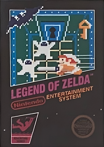
Retro The Legend of Zelda's original planned box art seen for the first time in decades
- Thread starter mazi
- Start date

- Pronouns
- He/Him
Had not seen this before but NGL a lot happier with what we got
Mbolibombo
Tingle
- Pronouns
- He/him
Wouldve been interesting to see how some box art would have turned out had they continues with the black series style.
D
Deleted member 341
Guest
Link is giving me serial killer vibes
Sturmgeist
Resident Hollow Knight and FFVII Superfan
- Pronouns
- He/Him
Very interesting to see, but holy shit am I glad we got the other one instead
- Pronouns
- he/him
Burying the lede on the Punch-Out box art too 
Closer to Tower of Druaga than Pac-Man but definitely could get that impression based the box art!Like it is a Pac-man clone or something.

Serif
𝕽𝖊𝖓𝖊𝖌𝖆𝖉𝖊 𝕬𝖓𝖌𝖊𝖑
Yeah that straight up looks worse imo. Obviously they're limited with what they can show but it focusing on the dungeon crawling, locked doors and swordfighting gives a narrow impression of the game. The coat of arms on the final box art gives off pure fantasy vibes that leaves more open to the imagination, which works in favor of a graphically limited NES title.
Apopheniac
Monolith Soft action game truther
- Pronouns
- he/him/his
Don't think this was "originally planned" per se, the boxes for Zelda and Punch-Out seem to be mockups/placeholder
CyberWolfBia
I talk more about games than I play them
- Pronouns
- She/Her
That's really cool! I also like Glass Joe in the cover of Punch-Out!!;
The Black Box strategy on early NES days was Nintendo trying to give a clear message to the consumer, since the Atari era was full of misleading cover arts and lead to the industry crash; But by the time Zelda came out in the west, I don't think the black box was needed anymore; people were already pretty much hooked on video games again.
The Black Box strategy on early NES days was Nintendo trying to give a clear message to the consumer, since the Atari era was full of misleading cover arts and lead to the industry crash; But by the time Zelda came out in the west, I don't think the black box was needed anymore; people were already pretty much hooked on video games again.
EtherPenguin
Koopa
- Pronouns
- He/Him
The pasted-on smile that doesn't match the pixel density killed me lol. It's like a reverse US Kirby boxart
- Pronouns
- he/him
The tweet says it was a retail targetted flyer they were giving out at CES 1987 which is usually held in January. Slalom would launch a few months later in March. Zelda was August, Punch-Out was in October. I don't see any reason to suggest these were mockups or placeholders instead of the first drafts for those two games.Don't think this was "originally planned" per se, the boxes for Zelda and Punch-Out seem to be mockups/placeholder
The Punch-Out replacement would be easy to explain since it lacks the Tyson rebranding so either the deal hadn't been finalized yet or they didn't have the new packaging designed.
Zelda could easily have been replaced due to Nintendo phasing out the "Black Box" design in 1987, probably to as a result of 3rd party developers who started to publish in the region in the back half of 1986 using box art that was less representational of the actual game images. This trend actually starts with Zelda which was sandwiched between it's FDS contemporaries Kid Icarus and Metroid which received the "Black Box" trade dress but with a silver background. I agree with @MisterSpo that it's also likely that Nintendo wanted to highlight Zelda as the game was a big hit in Japan on the FDS so NoA probably wanted to replicate that success as well. I could also see the box art not testing well with retailers leading to it being scrapped in favor of the design we all know.
CyberWolfBia
I talk more about games than I play them
- Pronouns
- She/Her
By the way, we ended KINDA getting a black box version of Zelda 1 on GBA ;P

- Pronouns
- He/They
op is really burying the lede by not noting the same flyer also promoted an unreleased sewing machine add-on for the NES.

japan eventually got such an add-on, but it was actually released on the Game Boy rather than the famicom.
japan eventually got such an add-on, but it was actually released on the Game Boy rather than the famicom.
Look over there
Bob-omb
Yes, but at least he's pointed at the foul undead inside of a dungeon, like a proper Good aligned serial killer/klepto.Link is giving me serial killer vibes
think this and punch-out look very good. maybe ultimately the gold was the rigut call for Zelda, but the punch out change is a shame
D
Deleted member 2
Guest
op is really burying the lede by not noting the same flyer also promoted an unreleased sewing machine add-on for the NES.
japan eventually got such an add-on, but it was actually released on the Game Boy rather than the famicom.
Makes me wonder - did they ever intend to produce that? All they needed was to make one for this advert.
Rick Bruiser
99-1
LOL @ Glass Joe on the Punch-Out!! box
- Pronouns
- He/Him
The black box covers look amazing. Sort of wish these all came out since it would give such a consistency, but can see how the gold worked out for the best probably. Good made Zelda look much cooler and probably served as more of an incentive to purchase.
Nintendo should add these as an option in NSO for the display.
Nintendo should add these as an option in NSO for the display.
Earthbounder
Boing!
- Pronouns
- He/Him
What we got was certainly better and iconic, but this one's pretty cool too.