• Hey everyone, staff have documented a list of banned content and subject matter that we feel are not consistent with site values, and don't make sense to host discussion of on Famiboards. This list (and the relevant reasoning per item) is viewable here.
  • Do you have audio editing experience and want to help out with the Famiboards Discussion Club Podcast? If so, we're looking for help and would love to have you on the team! Just let us know in the Podcast Thread if you are interested!

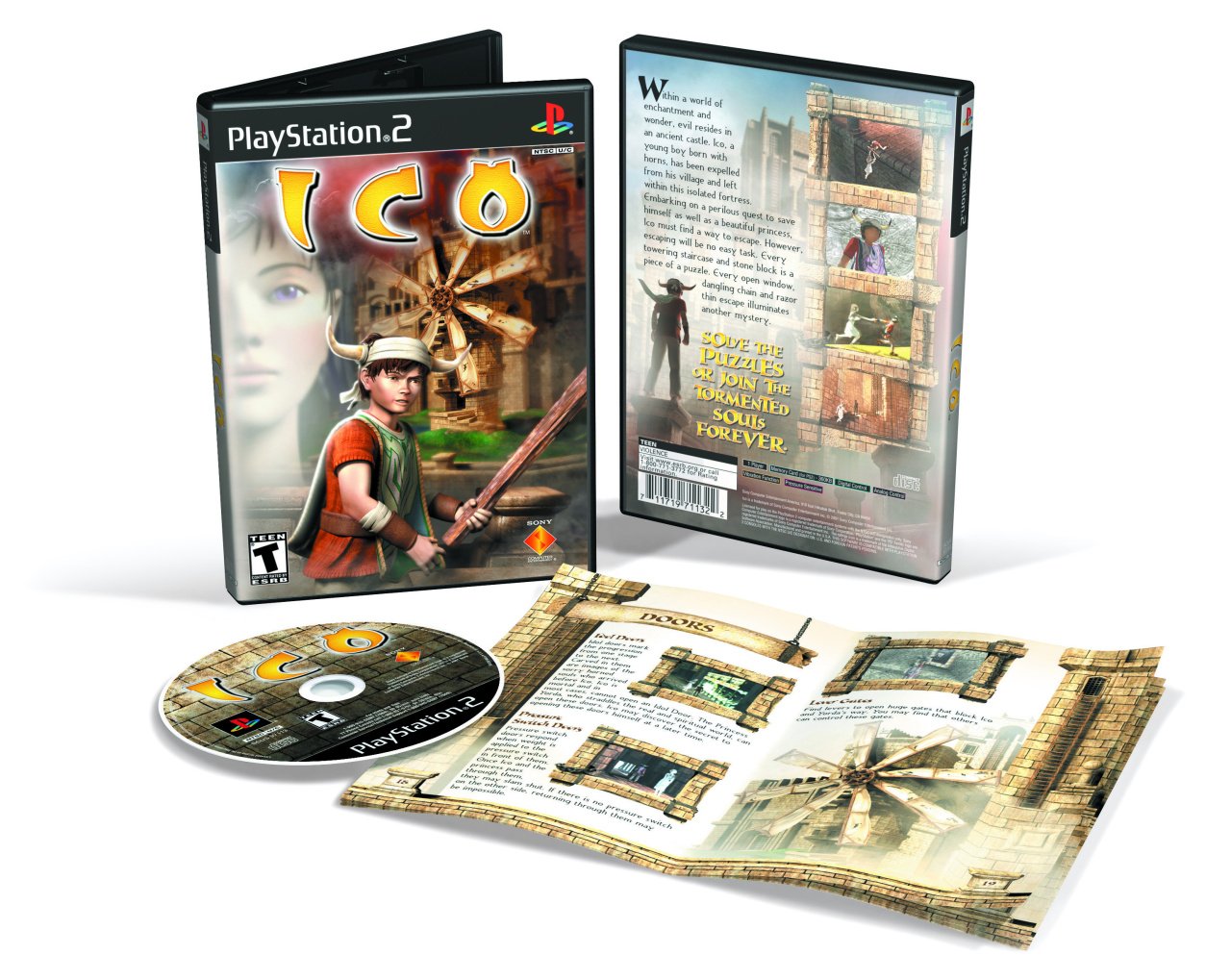
Fun Club the creator of the infamous US box for Ico speaks up, reveals why it turned out so poorly. "It was just a matter of timing"

Krvavi Abadas

Mr. Archivist
Pronouns
He/They
ico.large.jpg

for those unaware, the main issue is that the Japanese/Europe releases got a much more visually appealing hand-drawn sketch. which fit the tone of the game better.
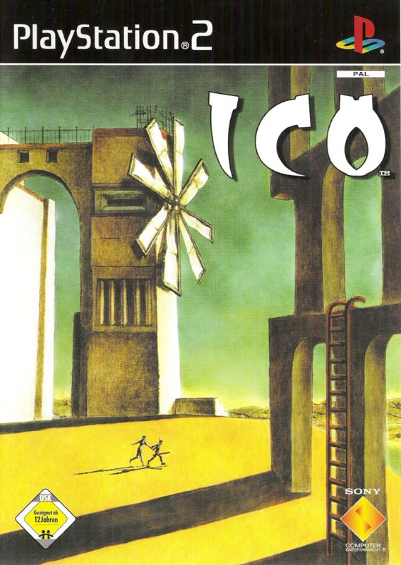
4377585-ico-front-cover.jpg

the VP of Sony's Japan Studio in 2009 even blamed it as a factor in why the game didn't sell well.
If the packaging was designed differently, we think it would have sold more - in fact on the internet many people have said that the Japanese version was better.

so what happened? as it turns out. the designer (Gregory Harsh) was on a very tight schedule, and only had a few screenshots to go off of. note that the game launched in the US first, and as such was noticeably unfinished beyond just the cover.
We started with Beeline’s sketch artist [Steve Lang] doing a few pencil layouts, which I modified in photoshop to meet whatever changes Sony had. Then (as a budding 3D artist) I pushed Beeline to let me take a crack at it in 3D using Lightwave. I don’t recall having much information about the game other than a screenshot or two.
he thankfully has taken the situation in stride, and is more than happy to admit that the Japanese cover is better.
It was just a matter of timing. At the time I was not involved in the meetings with Sony. I only became aware of the controversy when my package appeared on a "worst package fronts" list a few years ago. It's a badge of honor [now, and] I find the backlash against the cover amusing. I don’t claim it’s a great piece of art! And I too prefer the Japanese art - but the US was about a big logo and had a thing about big heads in the background (maybe because of movie posters?).
 
I can believe that the designer was under pressure from management to stick with whatever trends the marketing boss thought made a good cover. Which is why so many US video game covers were either ‘angry protagonist holding a weapon’, ‘big head’ or, in this case, both as photoshop is used to answer multiple requirements on a brief.
 
Last edited:
Covers are just a medium that was always done so dirty here in the states. So many confusing covers made just because some talentless marketing analyst said it was good.
 
Sounds like he did a great job with the time he had. The cover is definitely iconic no matter what you think of it so I think he should be proud.
 
Had wondered if something like a tight schedule was the culprit for this. At the same time, looking at it gives me a sense of nostalgia for the era all the same. It's not a good cover, but it just makes me go "haha, that's so early 2000's". I'd almost call it charming, in that sense.
 
0


Back
Top Bottom