
-
Hey everyone, staff have documented a list of banned content and subject matter that we feel are not consistent with site values, and don't make sense to host discussion of on Famiboards. This list (and the relevant reasoning per item) is viewable here.
-
Do you have audio editing experience and want to help out with the Famiboards Discussion Club Podcast? If so, we're looking for help and would love to have you on the team! Just let us know in the Podcast Thread if you are interested!
You are using an out of date browser. It may not display this or other websites correctly.
You should upgrade or use an alternative browser.
You should upgrade or use an alternative browser.
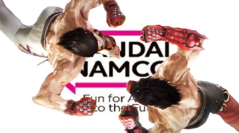
Discussion Bandai Namco joins the list of companies ruining their logo for absolutely no reason
- Thread starter Magic-Man
- Start date
- Pronouns
- He/Him
That is indeed awful. Why would they change it, their logo is iconic
Raccoon
Fox Brigade
- Pronouns
- He/Him
Seriously. It reminds me of Nintendo's "there's no play like it" thing they were briefly trying.The tag line is kinda dumb too
D
Deleted member 2
Guest
Bandai NamNO
- Pronouns
- he/him
The version where the names are still stacked on top of each other is sorta good. Would be better if the color was red instead of internet purple.
- Pronouns
- he/him
Already posted this on Era but

- Pronouns
- They/Them
It's kinda crazy just how nondescript this new logo is. Personally I was never a huge fan of the previous B-N logo in comparison to the old Namco and Bandai logos but damn that one is way better than this.
- Pronouns
- He/Him
This shit is so wack lol, I generally hate minimalism
- Pronouns
- He/him
That’s a pretty good view of the old logo. Think they could have tidied it up or made some kind of visual tweak to make it pop more. This looks like Twitch to me.Is this the first megaton news thread on FamiBoards?
I don't hate it in isolation, but the old logo always made me think of a lumpy Katamari:


CJ_arcadian
Rattata
I never thought their current logo (I guess former now) was something great or iconic, but it was fine, at least recognizable at a glance. The new one lost a lot of personality, and I actually find it kind of ugly. If they were looking for something more minimalist they should have looked towards the old pre-merger classic Namco red logo for inspiration, that was simple, but a good lesson in iconography and at least pleasing to the eyes.
- Pronouns
- He/him
Don’t fix what’s not broken Namco
Sander RX
Bob-omb
- Pronouns
- He, Him
This really doesn’t work as well.Just a dreadfully ugly logo
- Pronouns
- He/Him
Or brought back the BanPresto logoI never thought their current logo (I guess former now) was something great or iconic, but it was fine, at least recognizable at a glance. The new one lost a lot of personality, and I actually find it kind of ugly. If they were looking for something more minimalist they should have looked towards the old pre-merger classic Namco red logo for inspiration, that was simple, but a good lesson in iconography and at least pleasing to the eyes.
Sander RX
Bob-omb
- Pronouns
- He, Him
Both companies had superior minimalist logos pre-merger. Even just stacking them on top of each other would have looked better.If they were looking for something more minimalist they should have looked towards the old pre-merger classic Namco red logo for inspiration, that was simple, but a good lesson in iconography and at least pleasing to the eyes.
CJ_arcadian
Rattata
I forgot what the old Bandai logo looked like so I grabbed the case from Digimon World for PS1, and your absolutely right even the colouring matches. I get that they probably wanted something for their new "purpose" but they really missed the mark.Both companies had superior minimalist logos pre-merger. Even just stacking them on top of each other would have looked better.
Speaking of which I read the press release or whatever you'd call it that they put out with this new logo about their new era and purpose and it's just a load of nothing. If the point was to say that they intend to be a more global brand ( I would already consider them a fairly global brand even beyond video games ) they approached it quite awkwardly.
- Pronouns
- he/him
These aren't ideal, especially the ones that mix two fonts, but at least they have some sort of style and character. I always feel bad about shitting on a graphic designer's job because you never know what they were asked for but the new one is just awful.