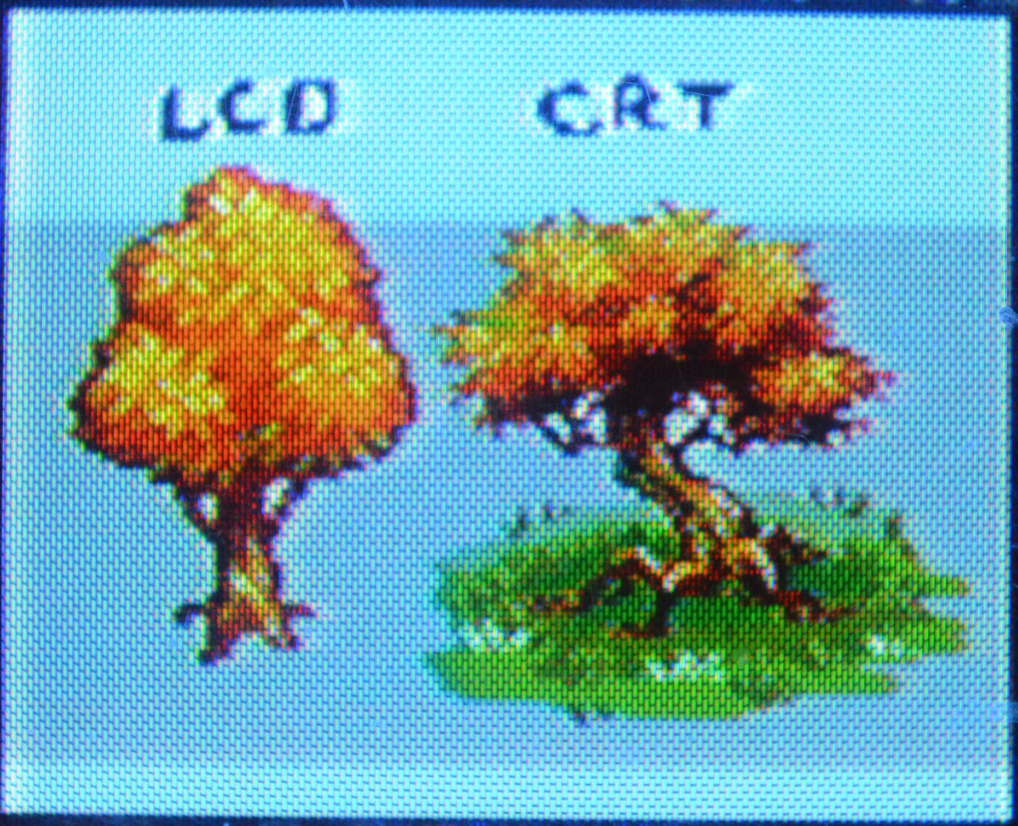
You can just think it looks ugly. That's ok, it's not really about "buying it." This just what games looked like on TVs that were the standard back then. There's nothing at all wrong with preferring raw pixels, I happen to think they look more beautiful that way in certain instances, but "stretched and smeared" look absolutely had to be intentional since that was the vast majority of what people would see and what developers would be creating games for, up to the late 90s/00s.
Well only that one particular image looks stretched in the comparison, which is kind of my point. There's no way every CRT had the same output, and these details that get pointed out are frequently way too specific to have come out looking the same on everything with differences in color, sharpness, brightness, etc. I think it's highly unlikely that developers were unaware of this and tried to optimize the look of their games for a specific CRT's image. An effect that worked on one model would just fall flat on another.
I'm a little more willing to entertain the idea that pixel art was made with universal elements of how CRTs handle images in mind, but even that is still pretty difficult to believe, especially the idea of it ever being a widespread practice across the industry when the basic competence of pixel art varied so dramatically and every other artistic technique for making games back then was anything but standardized.
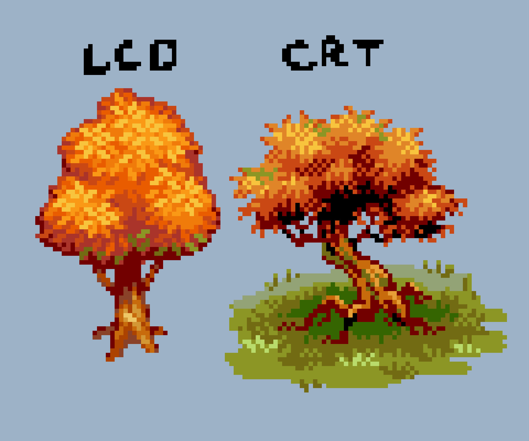
Of course many sprites were made to imply detail, that's just kind of how pixel art works. And that this is easier to read when the individual pixels are unclear to the eye is also just how vision works. But you don't need to rely specifically on CRT output for that, distance does pretty much the same thing. I think it's important to point out that these comparison shots are usually extreme close-ups that don't actually reflect how anyone was seeing these games back then either. A full CRT screen seen from a distance looks... pretty much the same as it would anywhere. It's so much less dramatic.
I don't actually have anything against the look of CRTs, there's a good chance I would actually end up going to bat for them as the superior format if I ever did an in-person comparison due to all the technical differences in how they work (though I think scanline filters are utterly pointless nostalgia wankery, it's like if you listened to music with a "vinyl filter").
It's just that the claims people make about them with pixel art seem completely ridiculous and impossible. I've never once seen quotes from people who actually made pixel art back then talking about any of this either. It doesn't help that everyone seems to have
different claims about the relationship between CRTs and pixel art. The whole thing smells of bullshit.
Some are entirely focused on scanlines as being where the magic happens, some only mention them in passing as a byproduct of how CRTs display images. You have the extreme CRT acolytes who hold opinions like "HD was a mistake, CRT is superior for everything, CRT and pixel art were made for each other", and apparently there are now people who claim there should be separate schools of pixel art for CRT and LCD displays and every indie developer is doing it wrong. (I highly doubt this was a thing back when CRTs and LCD handhelds actually existed side by side...)